Setup Slack alerts for SQL data changes
Without SQL or coding, quickly set up graphs on the database along with Slack or email alerts. Build complex dashboards and monitor data easily.
Data analysis is one of the most critical factors that lead to success for any organization. In simple terms, data analysis is drawing conclusions on the basis of your current data and using those conclusions to optimize your organization’s performance, speed, and efficiency. Constantly analyzing your current business model can help reduce costs by identifying more efficient ways of doing business. For example, in any e-commerce company, analytics can help in understanding customer trends and satisfaction with regard to new product launches. This way, you can focus on products that are performing well by using your resources to optimize and improve them, rather than focusing on products that are not well accepted by your customers.
That being said, getting insights into your data doesn't mean you have to leave your current role and spend all your free time learning to write correct SQL queries or code. Tools like Draxlr readily provide you with a full analysis of your data, which in turn helps you focus on the business side of data analytics. It involves finding patterns in your data sets, making decisions and predictions on the basis of the current data, and re-evaluating the decisions and the patterns at specific time intervals. When you focus on making better data-driven decisions, it shows up in your business, and that’s the key for any organization to progress. Setting up periodic alerts on your data is also an effective way to keep track of how the business is performing, and the alerts can easily be configured to be sent via email or directly on Slack.
There are a lot of ways in which data can be presented for any company to make decisions based on it. As per your convenience, you could present your data in various types of graphs, which makes it easier to understand and explain. Not only graphs but also dashboards make life easier for any organization. Let us dive deep into how we can achieve this without actually using any SQL on our data, with the help of this simple tool. Along with that, we will also learn to set up Slack alerts easily so that we do not have to worry about looking at the data every other minute.
Note: Before moving ahead, you can read up here on how to connect your database with Draxlr and the various operations you can perform on your data.
Building Graphs
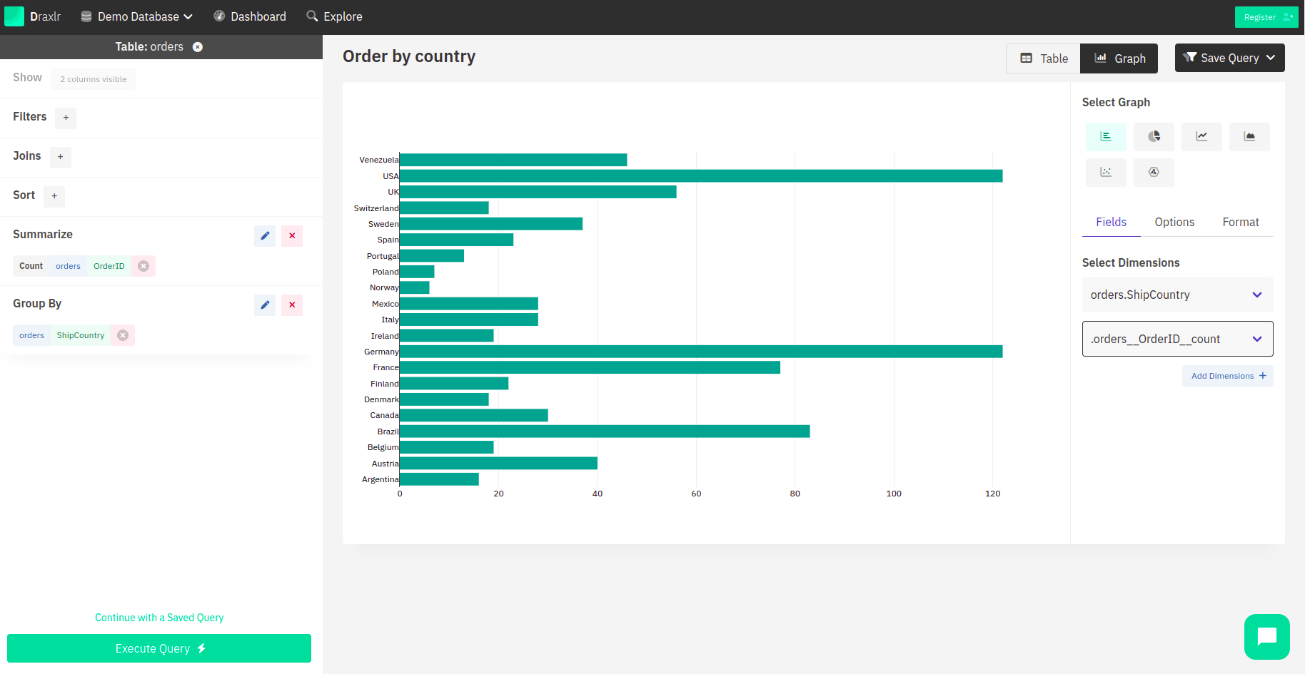
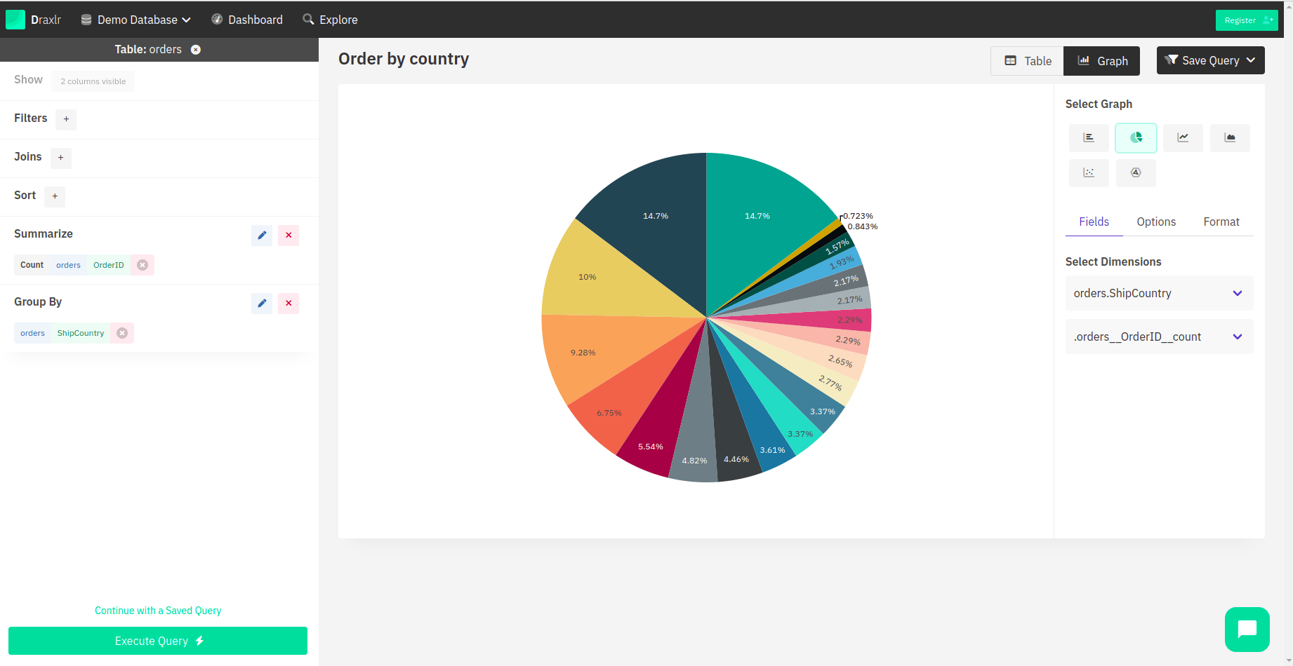
Graphs and charts are successful visual tools because they present the data quickly and clearly. They also highlight trends and comparisons in a straightforward way, which also makes them super helpful in making business decisions. After you have successfully connected your database with Draxlr, you can perform queries on the database, as explained in depth here. By default, the results are displayed in tabular format, but right next to them, you can see a Graphs option.

Once you click on that, you get to select from a variety of graphs. Below is a brief explanation of all the types of graph options available:
Bar Chart
In this graph, you select the X-axis and the Y-axis dimensions, which are basically the columns you want to depict. It represents data in the form of rectangular bars, with their height proportional to the values that they represent.
Pie Chart
It is also referred to as a circle chart, which is divided into slices to demonstrate numerical proportion. The full circle always adds up to 100, and it uses different colours to show different percentages of values.
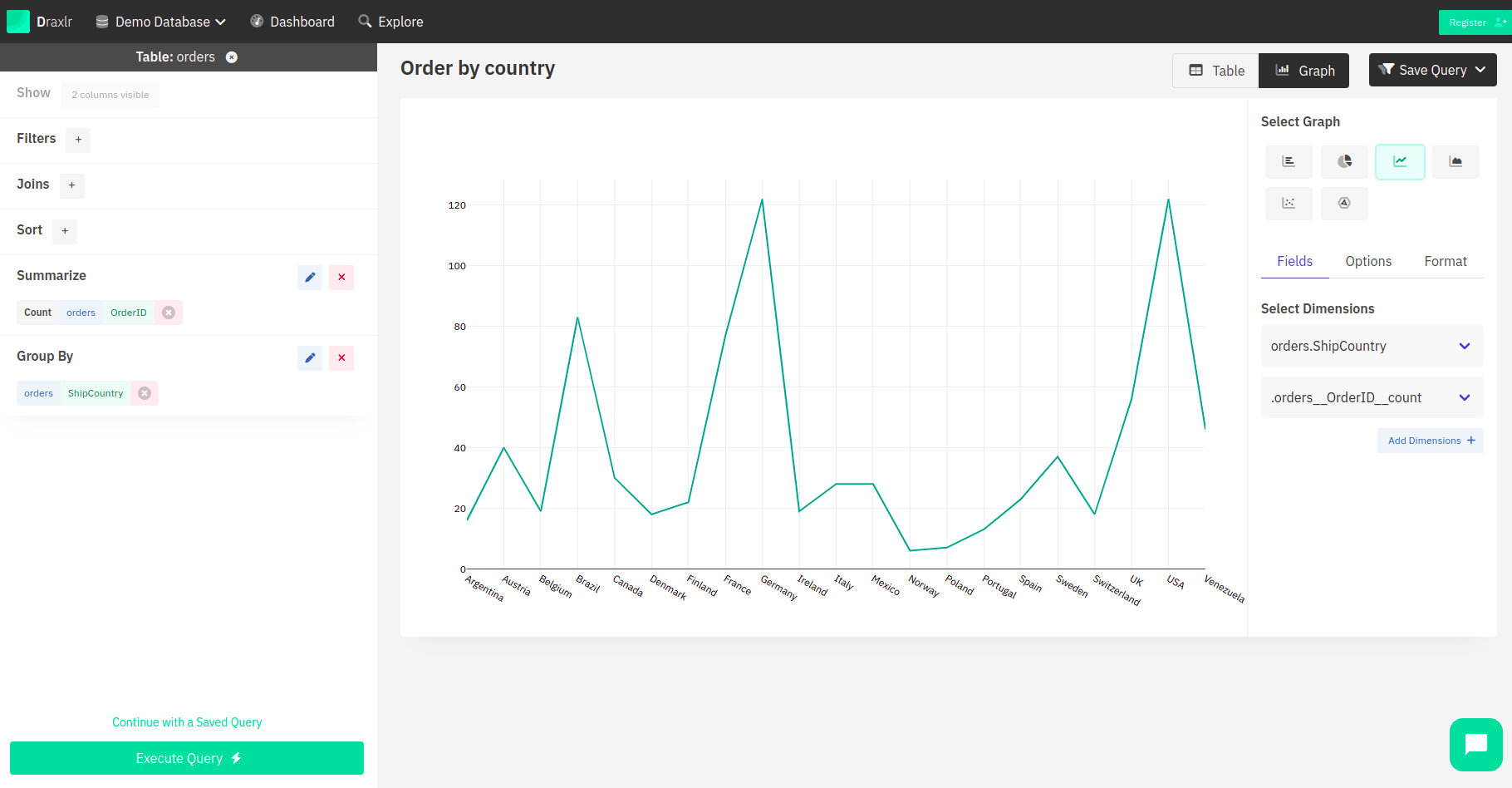
Line Chart
This type of graph connects a series of data points with a continuous line. It is mostly used to visualize a data point’s behaviour over time.
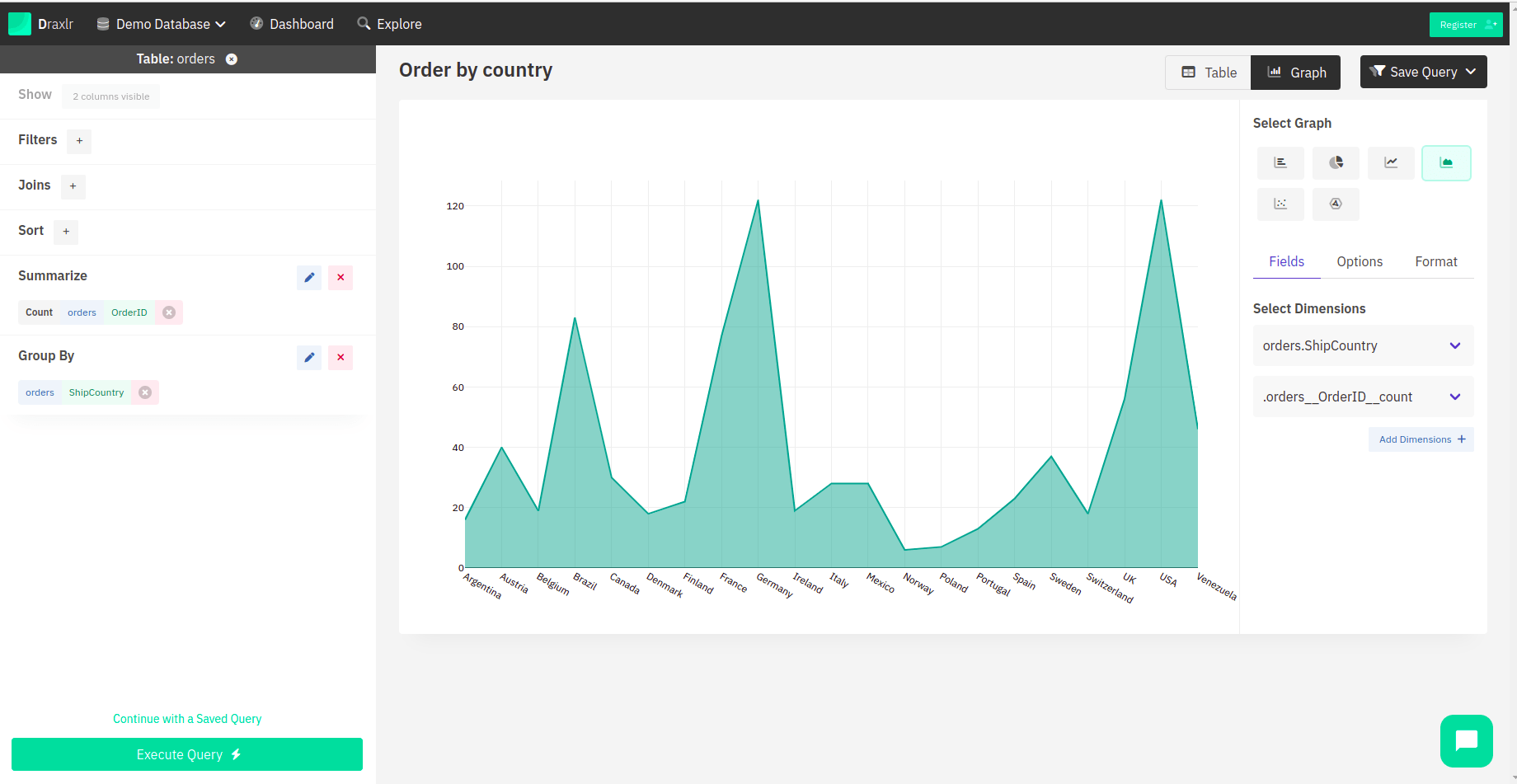
Area Chart
It is an amalgamation of bar charts and line charts. It is used to illustrate the change in a value or multiple values against a particular constant factor, which is usually time.
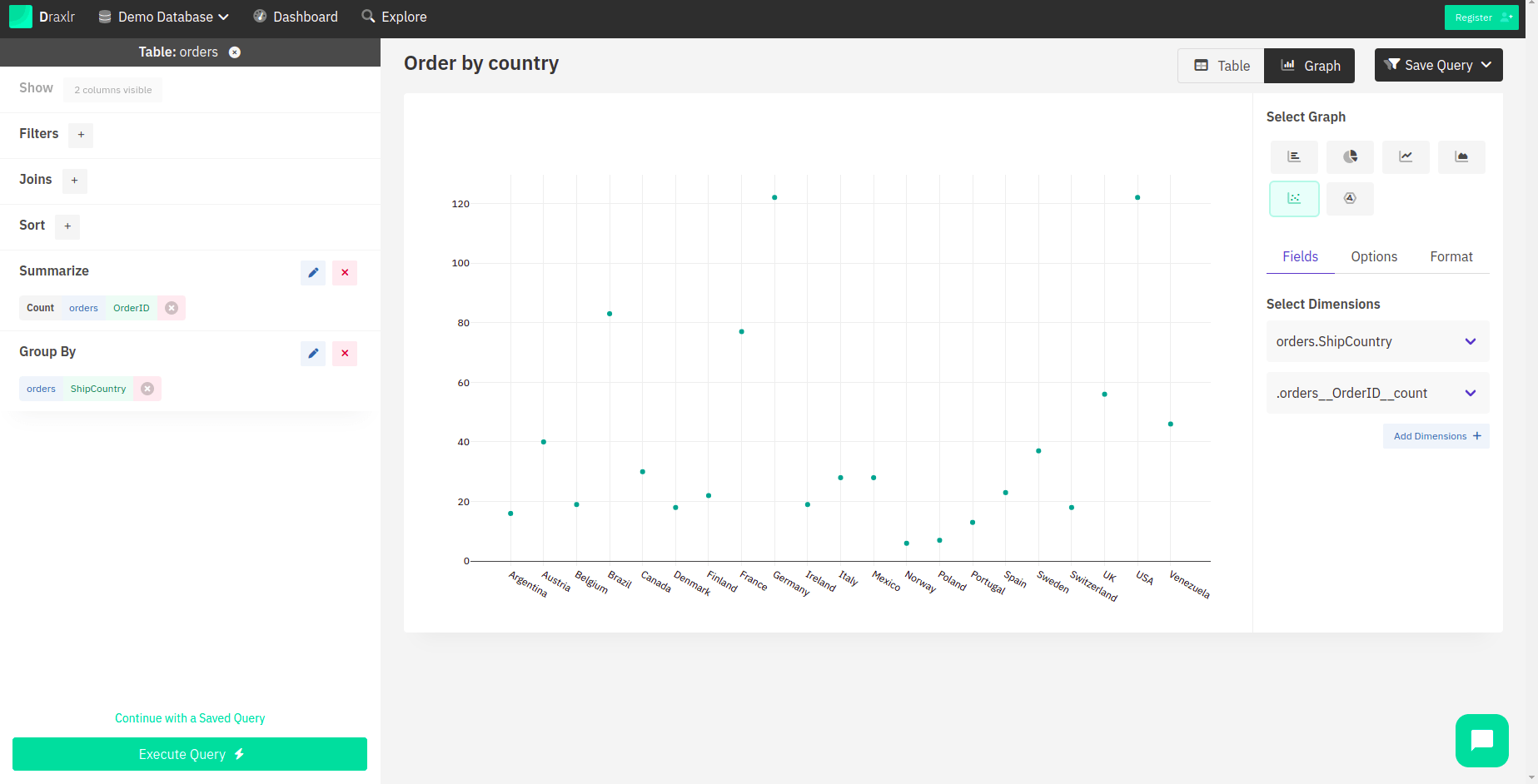
Scatter Chart
In this category of graphs, data points are plotted on a horizontal and a vertical axis in order to represent how much one value affects another. It is common practice to plot the independent variable on the X-axis and the dependent variable on the Y-axis.
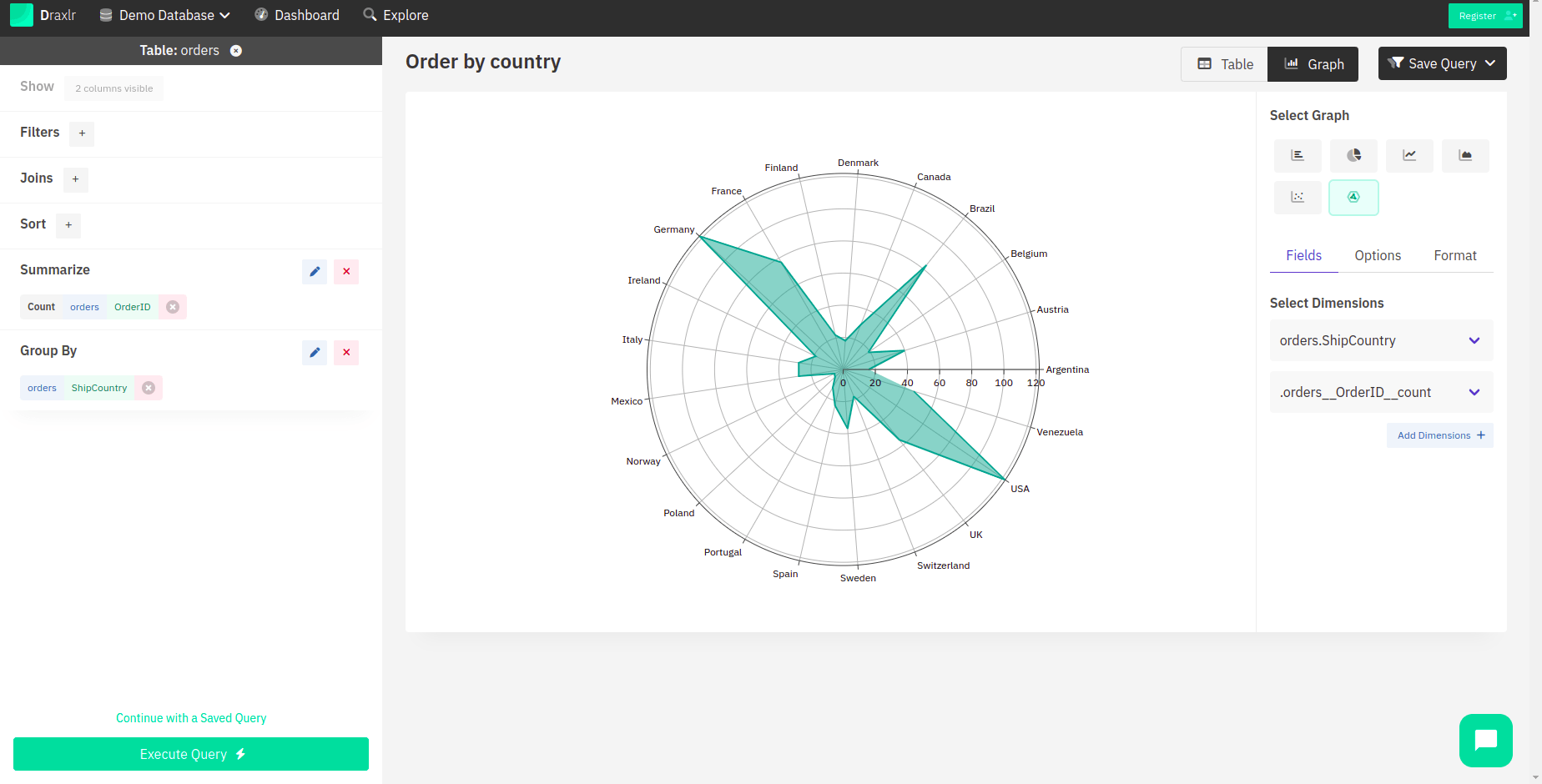
Radar Chart
Radar charts are used in places where we need to compare two or more data points on different features. In simpler terms, it is used to show multiple data points and variations between them.
You can pick the chart that suits your organization and its needs. In presentations, pie charts and bar graphs might help the team understand the data better, and to understand how sales have been in the past year, line charts can be of use. Not only can you choose a suitable graph, but you can also give a title to your graph. Moreover, you can also set precision, and in the case of monetary fields, you can choose to format the values as currency, wherein you have a lot of currency options to choose from.
Building Dashboards
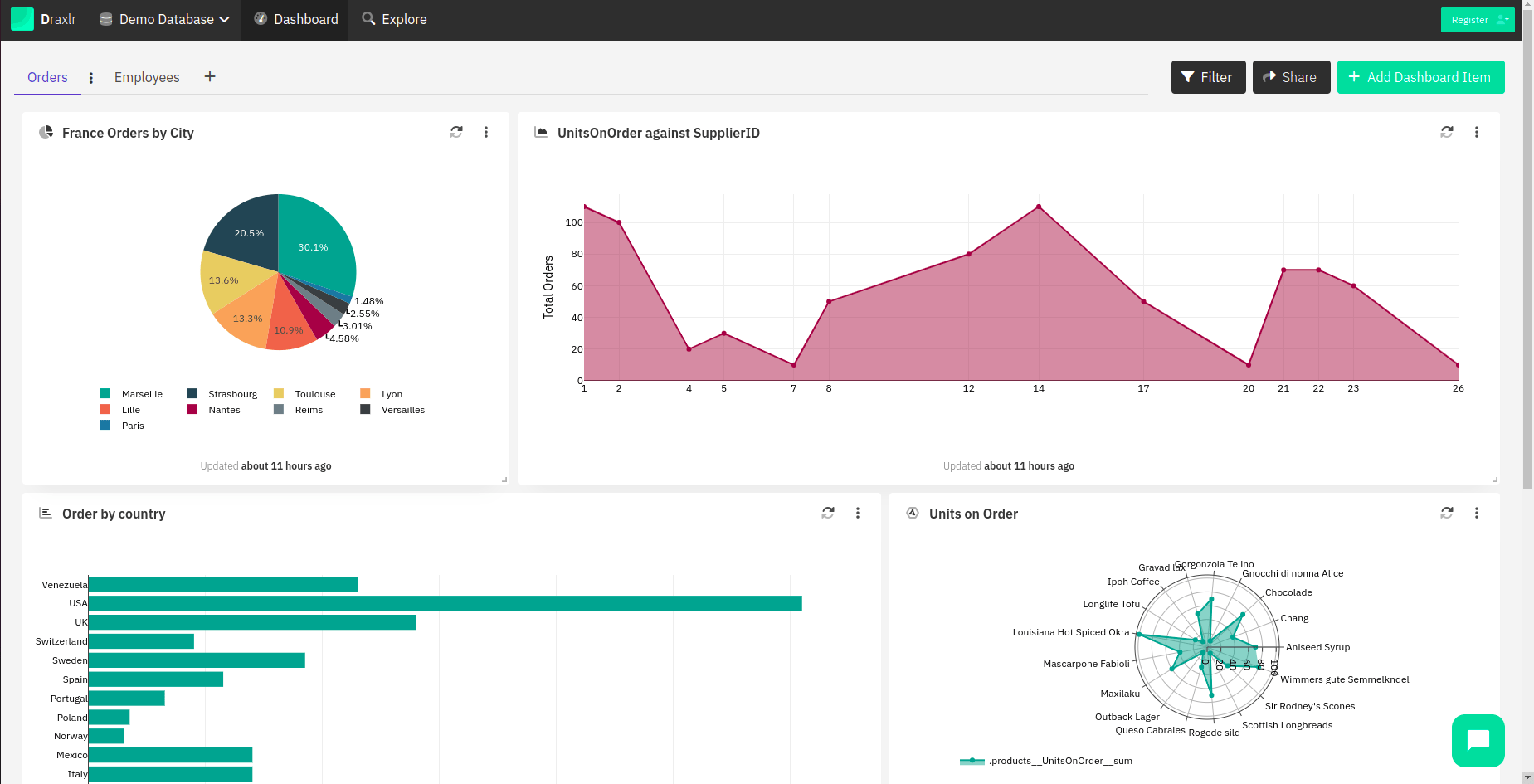
Graphs are important, but what is even more important is for them to make sense—that is where the dashboard comes into the picture. You can combine various graphs into one dashboard so that all the data needed can be accessed right from the dashboard itself. For example, if you want various data points on the orders that your company receives every month, you would need graphs for orders received from certain cities, certain categories, and the peak time at which most orders are placed for you to boost marketing at that time.
Get started
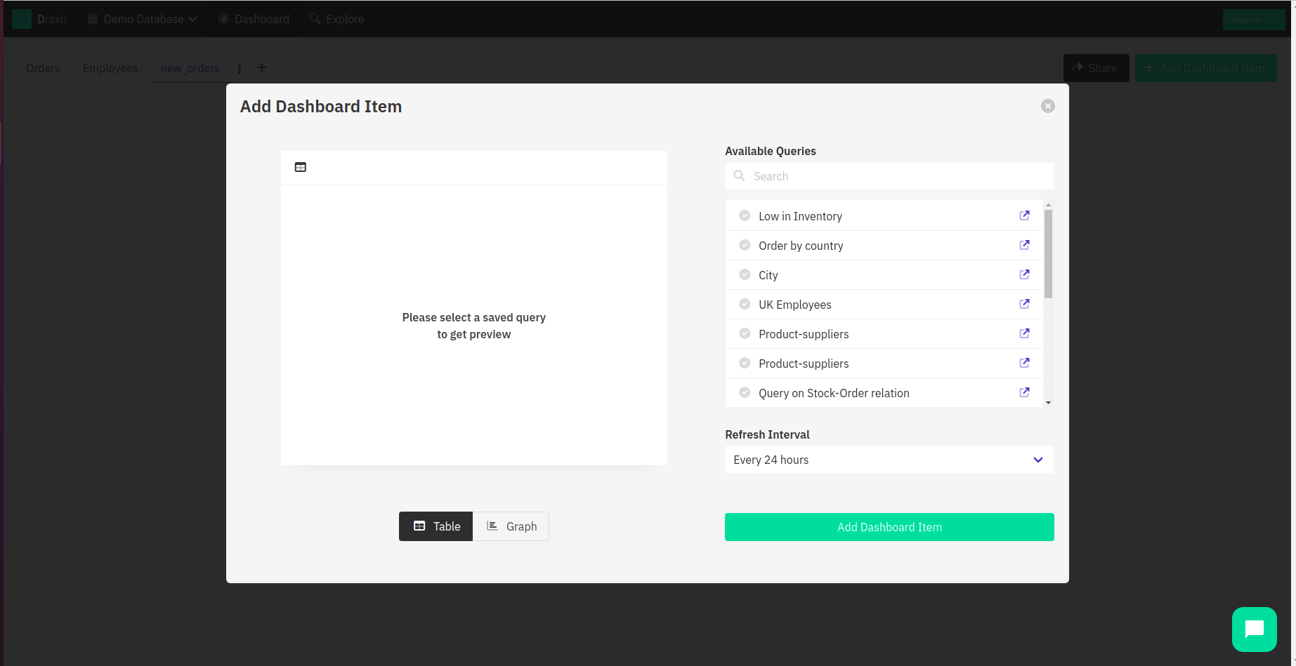
To get started, you can save the queries that you want to show in your dashboard. Then add a new tab under your Dashboards section. You can then add a new dashboard item that will fetch your saved queries in either table or graph format. You can also specify the refresh interval, which is, by default, 24 hours. The refresh interval is the time period after which the query again hits your database and fetches new and updated information.
Diving deep into the dashboard
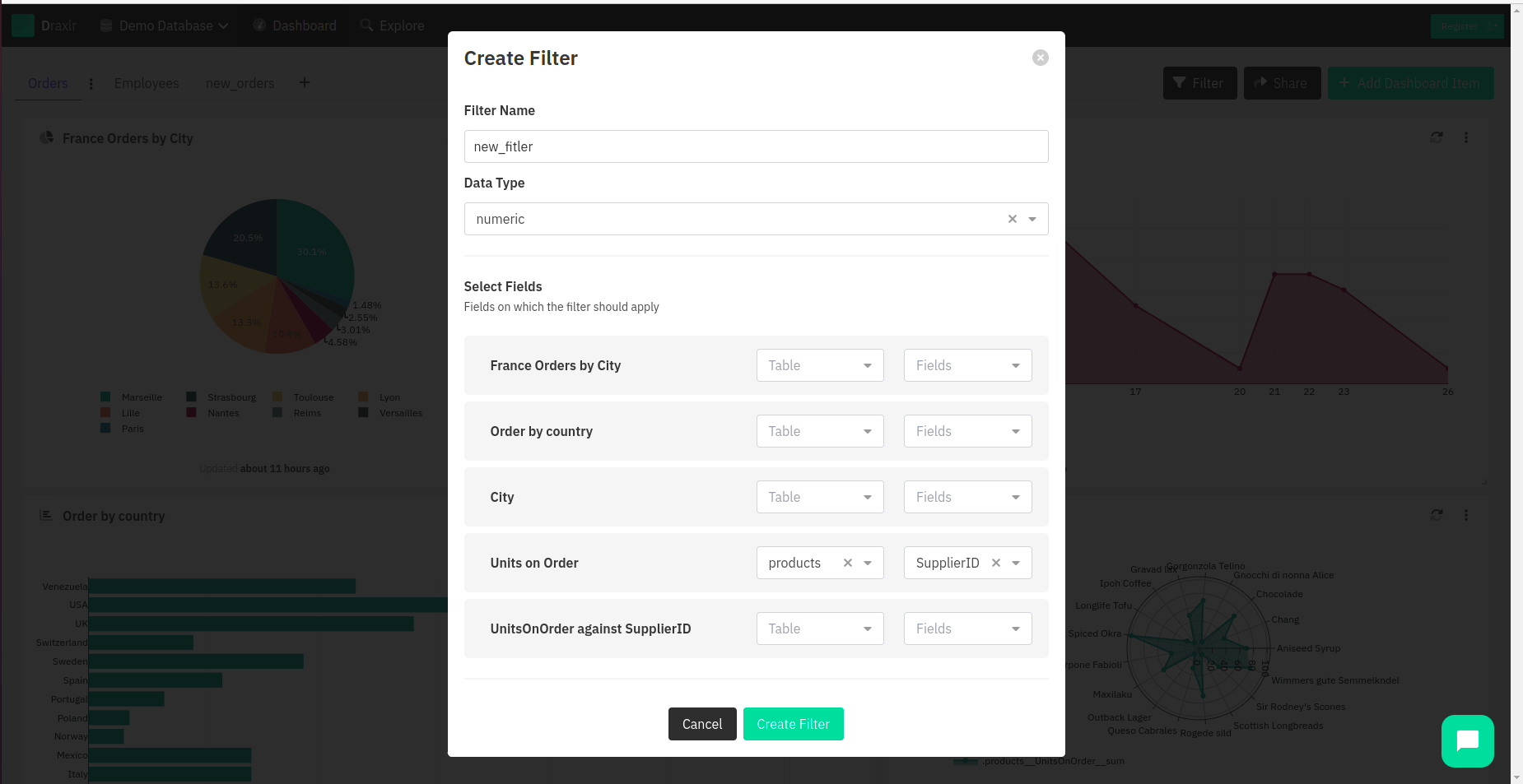
After you have imported quite a few queries, you can also perform operations like filter and share on your dashboard. For example, if you have a saved query that shows you orders placed from every city, you can add a filter for a particular city in the dashboard. Not only this, but what makes Dashboards a star product of Draxlr is the fact that it is so easy to share! You can generate a link that can either be used publicly or with a pin, in cases where you want to keep your dashboard private. You can also generate an embed link that you can embed into any HTML page.
Dashboard Options
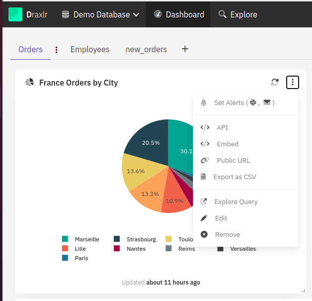
On every individual graph that shows up on the dashboard, you can perform a lot of operations. You can set up alerts, export the data as CSV, or just share that particular graph as a link. You can also refresh the query at any time at your convenience. Apart from that, you can edit and also remove the query if it has become irrelevant.
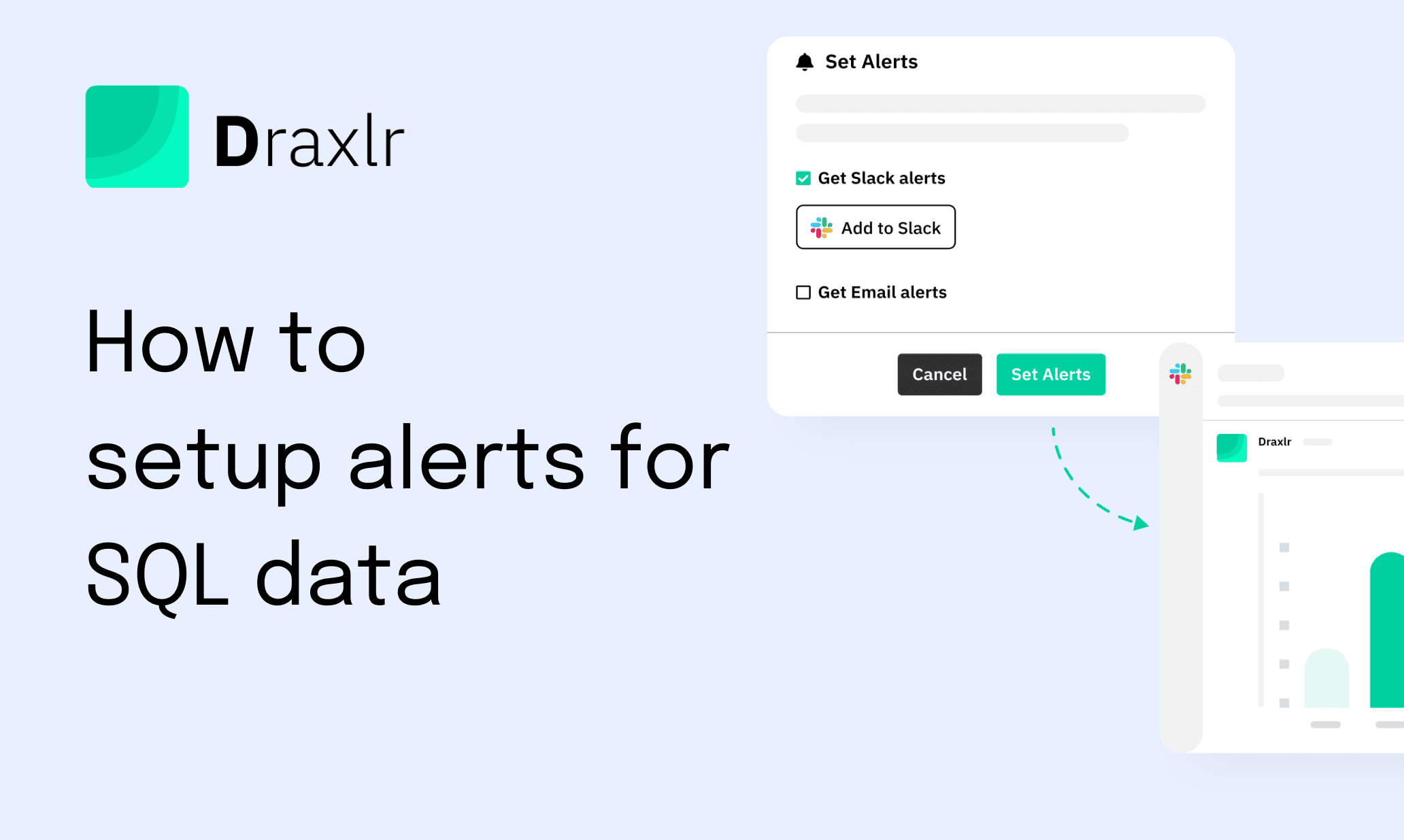
Setting up alerts
As an organization, there are umpteen things that need looking after. There is no human way for someone to monitor the data all the time and report cases of anomalies or discrepancies. For example, if you’re at a movie on a Sunday at 7 PM and a fraudster somehow decides to spam your orders and places 1,00,000 fake orders, it could cause a huge toll on your database instance, which might or might not be prepared for such a mishap. On the contrary, if some figures are organically skyrocketing, it is important for you to know about it so that you can put more effort in that direction. For all the good and bad reasons, alerting is an excellent feature that can help you keep your worries at bay and focus on building a better product.
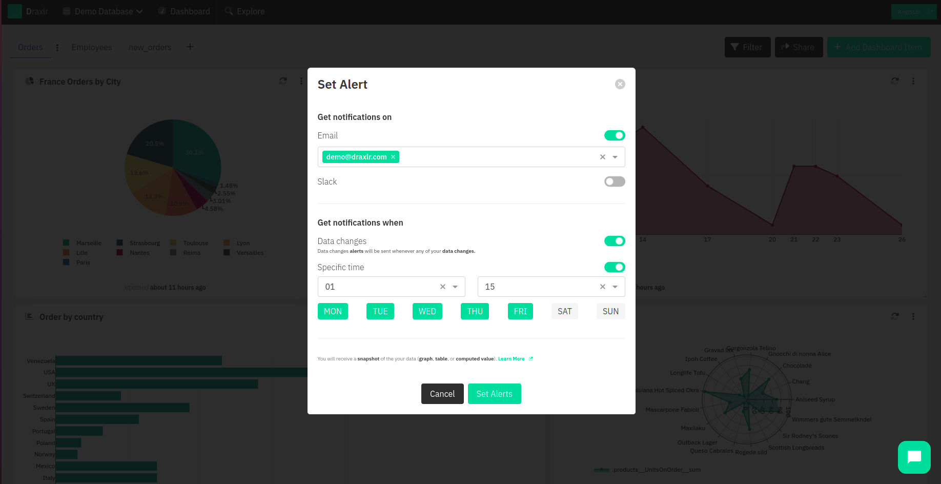
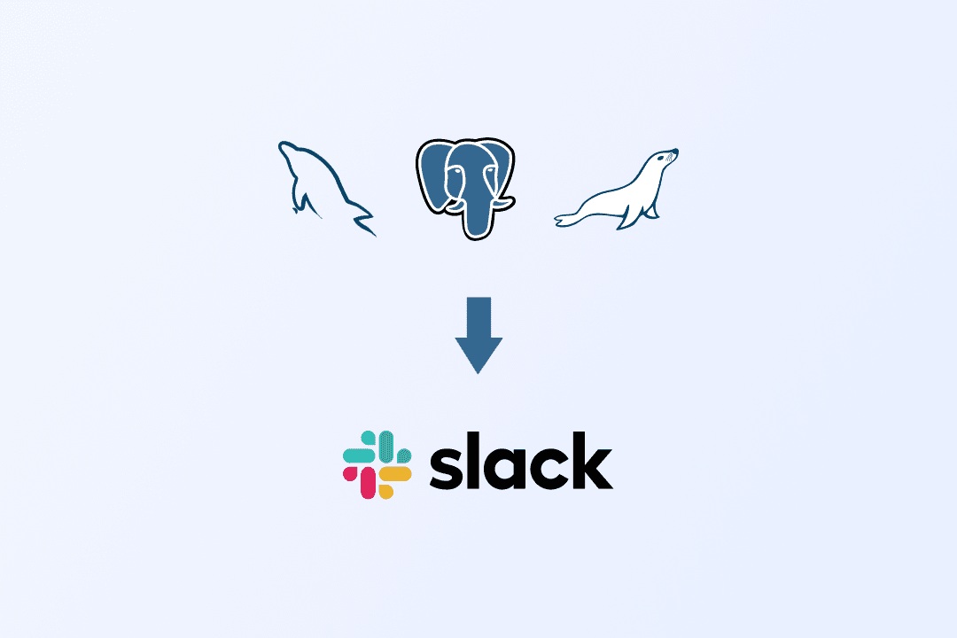
You can receive alerts on Slack, email, or both. To receive alerts on Slack, you would have to connect your Slack with Draxlr. You do not have to change any SQL data for these operations; all you have to do is set it up, sit back, and focus on other essential things. For receiving email notifications, you can provide an email (or multiple emails) to which a notification will be sent whenever the condition you have specified for alerting occurs. Read on to find out about the conditions under which you can set up alerts:
Data Changes: In this particular condition, whenever any of the data goes through any changes, a notification will be sent out via Slack, email, or both, as per your specifications.
Specific Time: If you are someone who would want a daily report at a fixed time every day with all the data from the graph or the table, then this setting is for you. It would give you a fetch of your query at a time you specify, and on the days you select, you have the freedom to choose all the days of the week or any particular days.
Threshold-based: In cases where your data reaches a particular checkpoint, you will receive an alert. For example, you would be notified if your orders crossed 10,000 entries a day.
Data is a lot of unprocessed information, and for it to make sense, you have to make observations and draw conclusions on the basis of the data. Data-driven organizations are always a step ahead of their competitors because they know what their customers want and they focus hard on building it. By using graphs and dashboards, analysis becomes a lot easier, and the organization can focus on the next steps, which are planning and execution. Setting up alerts is crucial as well; it is humanly impossible to monitor data at all times, so remaining updated with your database through Slack or email alerts takes a lot of pressure off the business.
However, that is not all. It is important to set up alerts and be updated with the latest figures so that you can modify the business plans accordingly. Setting up slack and email alerts and being in constant touch with data is as important as analyzing it. Building a product is not easy, but with Draxlr taking the heavy burden of analyzing data and alerting you when needed off your shoulders, you would definitely feel more independent and focused on improving your organization.