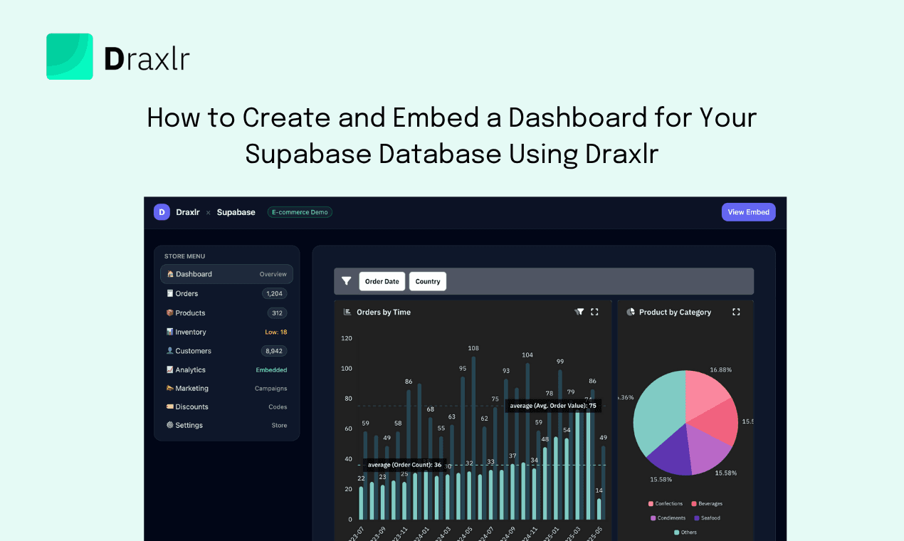
How to Build a Supabase Dashboard and Visualize Your Data
Build a Supabase dashboard with Draxlr: connect your project, query it with no-code, SQL, or AI, visualize it as bar to Sankey charts, and set data alerts.

A Supabase dashboard turns the tables in your Supabase Postgres database into charts your whole team can read, without anyone writing custom code or waiting on the engineering team. This guide shows how to build one with Draxlr: connect your Supabase project, build queries in one of three ways, pick a visualization, add it to a dashboard, and set alerts so the numbers come to you.
Visualizing your Supabase data helps you:
- Read large tables quickly and spot patterns and trends
- Catch anomalies, like a sudden drop in sign-ups, before they turn into problems
- Share the same numbers with product, support, and leadership
- Make decisions on live data, not last month's export
But first, what is Supabase?
Supabase is an open-source Firebase alternative built on Postgres. Every Supabase project is a full Postgres database, and Supabase adds:
- APIs to access your data and run queries
- Authentication, with row-level permissions on your data
- Edge functions for custom code that scales
- Storage for images and videos
- Integrations with machine learning platforms
How to build a Supabase dashboard with Draxlr
Draxlr is a Supabase technology partner. It's a BI tool for building dashboards, setting data alerts, and embedding dashboards in customer-facing apps. See the Supabase dashboard tool page for a feature overview.
Here is a quick video walkthrough of building a Supabase dashboard from Supabase data in Draxlr:
Ok, let's get started.
Step 1: Connect Supabase to Draxlr
Draxlr connects to your Supabase project's Postgres database with standard database credentials. It syncs your table and field metadata and queries Supabase live, so your data stays in Supabase.
- Find your Supabase credentials. In the Supabase dashboard, open your project and click Connect in the top bar. Use the Session pooler parameters, because they work over IPv4, which external tools like Draxlr need:
- Host: for example,
aws-0-us-east-1.pooler.supabase.com - Port:
5432 - Database name:
postgres - User:
postgres.<your-project-ref> - Password: the database password you set when you created the project. If you don't have it, reset it under Project Settings → Database.
- Host: for example,
-
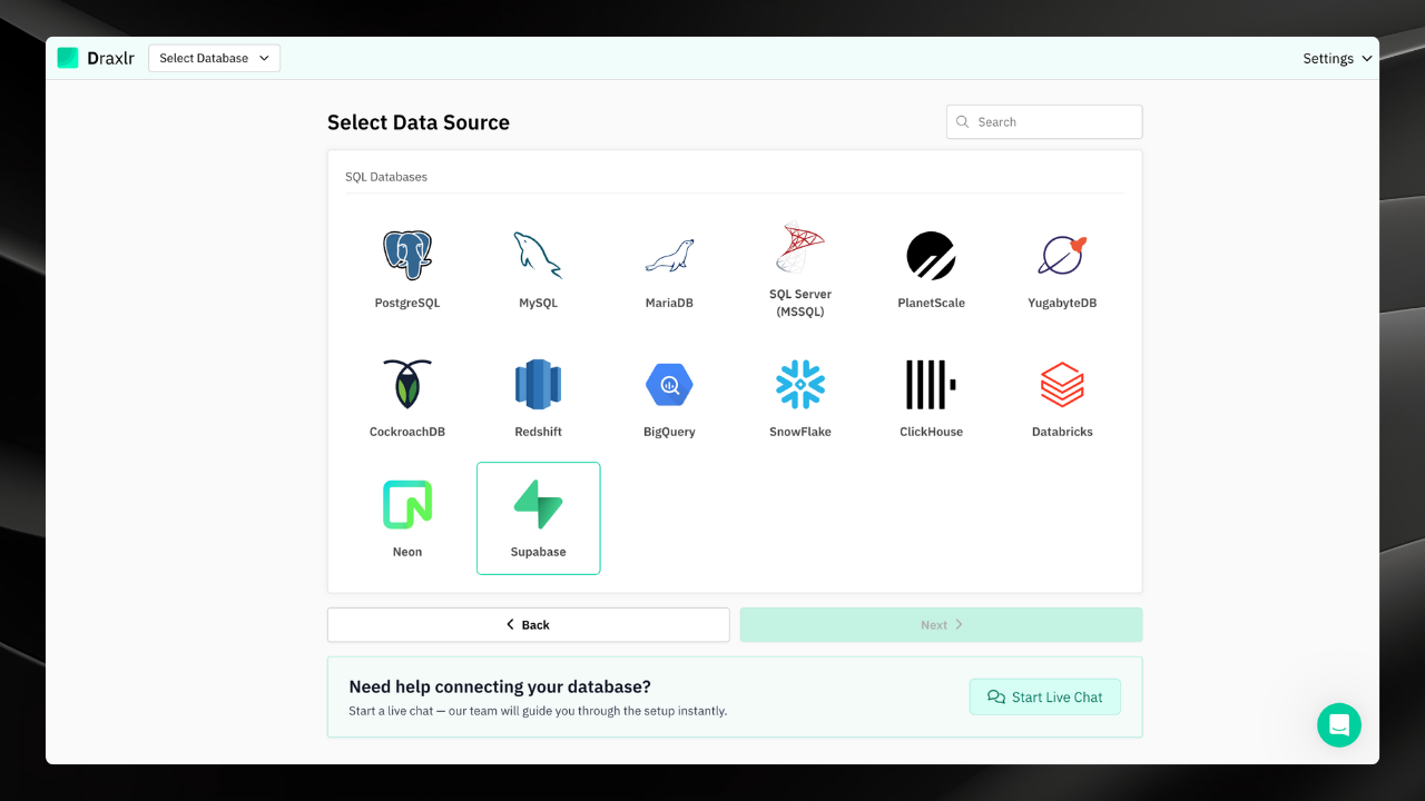
Select Supabase in Draxlr. Log in to Draxlr, open the Add Database page, select Supabase, and click Next.
-
Enter your credentials. Give the connection a name, then enter the host, port, user, password, and database name, or paste a connection string with Import from URL. Supabase accepts connections from anywhere by default. If you turned on Network Restrictions, add Draxlr's IP address, shown on this form, to your allowed list.

- Pick a schema. Draxlr lists the schemas in your database. Select the one you want to connect, usually
public, and click Next. -
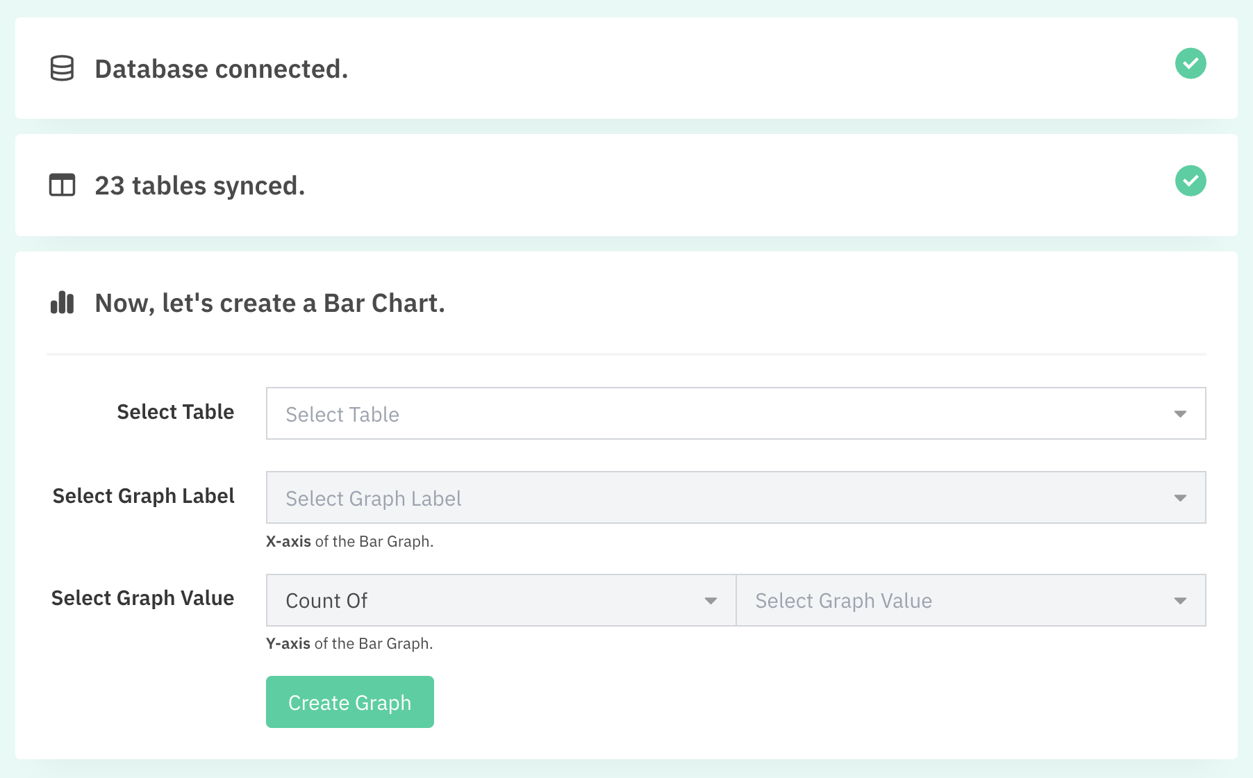
Create your first chart. Draxlr syncs your tables and walks you through a simple bar chart. Select a table, then choose the x-axis label and the y-axis value.
-
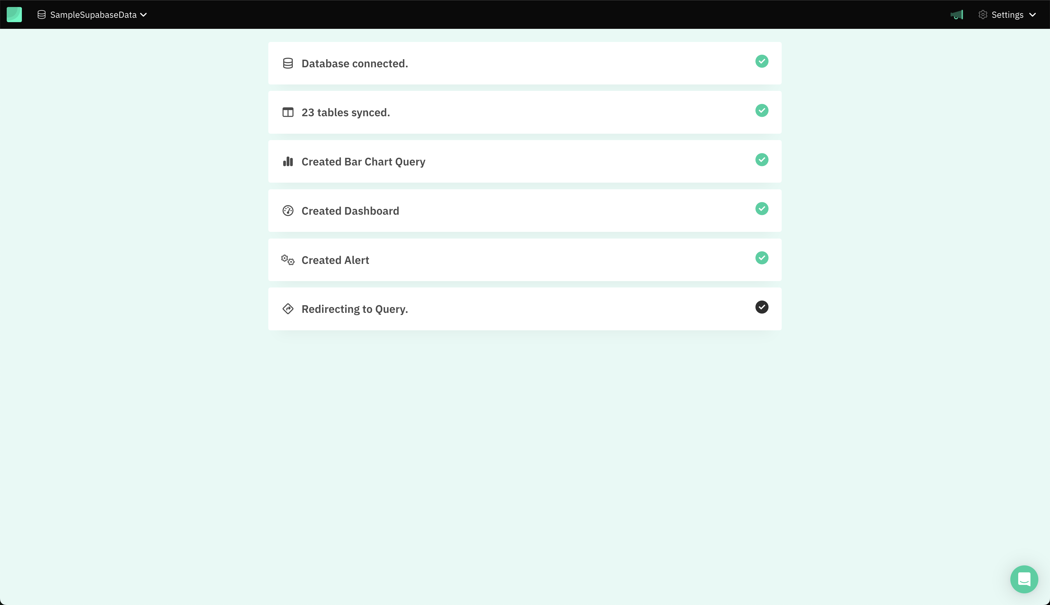
Finish onboarding. Draxlr adds the chart to a dashboard and sets up an email alert that notifies you whenever the chart's value changes.
Step 2: Build a query from your Supabase data
Every chart starts with a query. Draxlr gives you three ways to build one, so people with different levels of SQL experience can all work with the same Supabase data.
1. Query builder (no code)
The no-code query builder lets you build a query through a visual interface, one step at a time. Each step applies to the result of the previous one, so you can build complex queries without SQL. It has five options:
- Filter: keep the rows that match conditions on a field, combined with AND or OR
- Join: combine Supabase tables, using detected foreign keys or a custom join
- Sort: order rows by one or more fields, ascending or descending
- Aggregate: group rows by a field or a date interval, and apply functions like count, sum, average, min, and max
- Select: choose which fields appear in the result
2. Raw SQL
If you're comfortable with SQL, write the query yourself in the raw SQL editor. You can add variables with double curly braces, like {{start_date}}, and connect them to dashboard filters so one query serves many views. The Supabase SQL query cheat sheet covers the Postgres syntax you'll use most.
3. AI-generated SQL
Describe what you need in plain English, and Draxlr's AI turns your plain-English prompts into SQL queries that match your Supabase schema. You can view and edit the generated SQL before you use it, which saves technical users from writing the same base queries again and gives everyone else a way in.
Step 3: Visualize your Supabase data
Once the query returns the data you want, choose how to show it. Draxlr supports common charts like bar, line, area, pie, doughnut, and scatter charts, plus funnel, Sankey, treemap, map, and box-and-whisker charts. Each chart can be customized, including colors, labels, and axes.
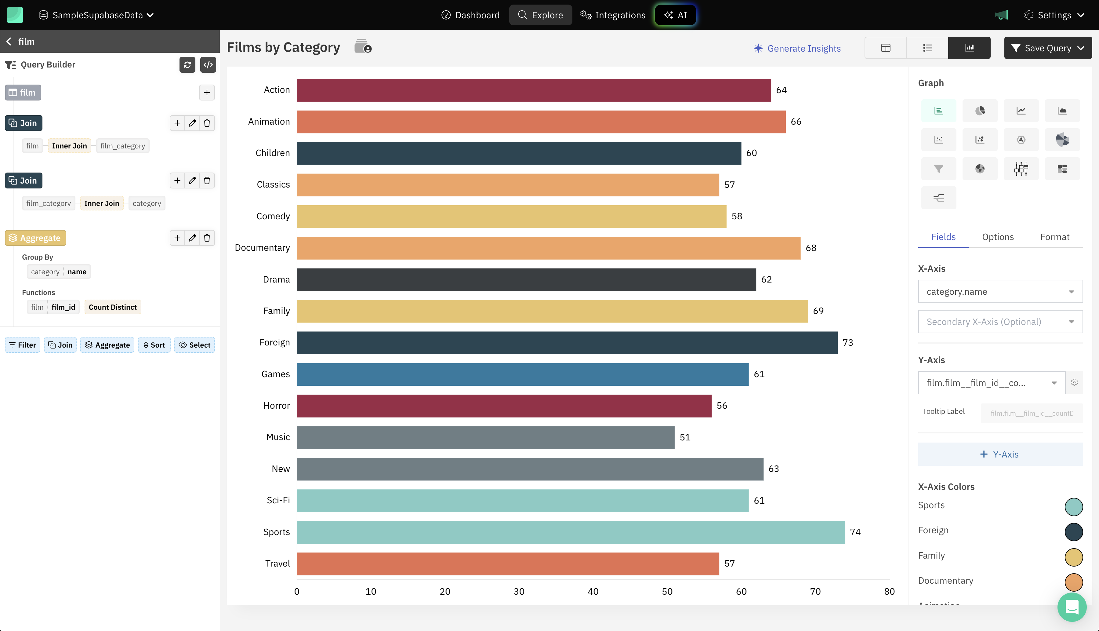
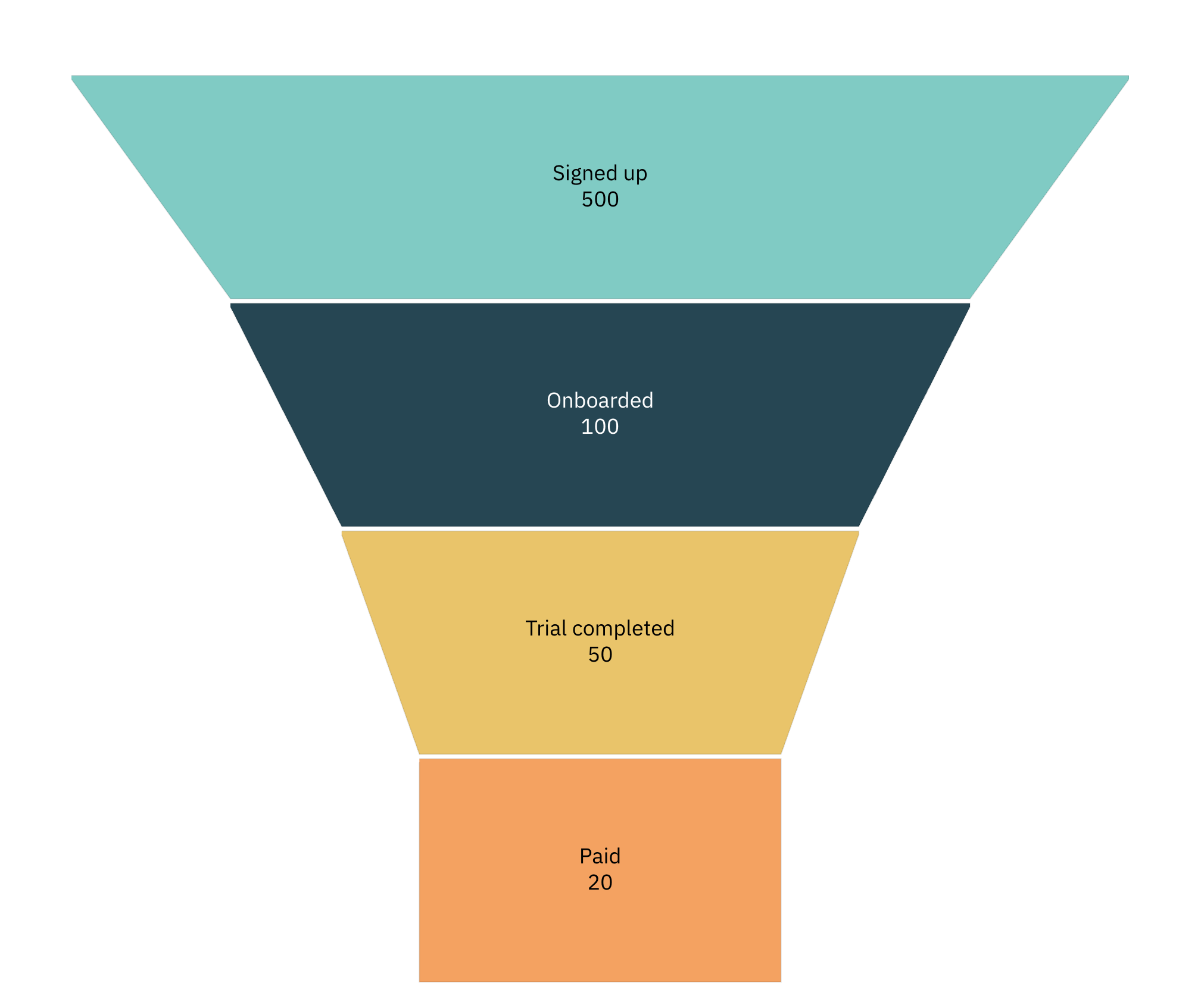
A few chart types that work well for product data in Supabase:
-
Funnel chart: shows how many users make it through each step, from sign-up to paid.
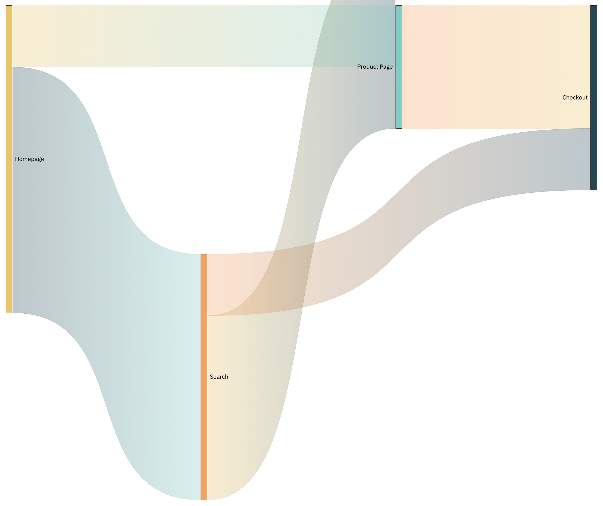
-
Sankey chart: shows how users flow between pages or states, like homepage to search to checkout.
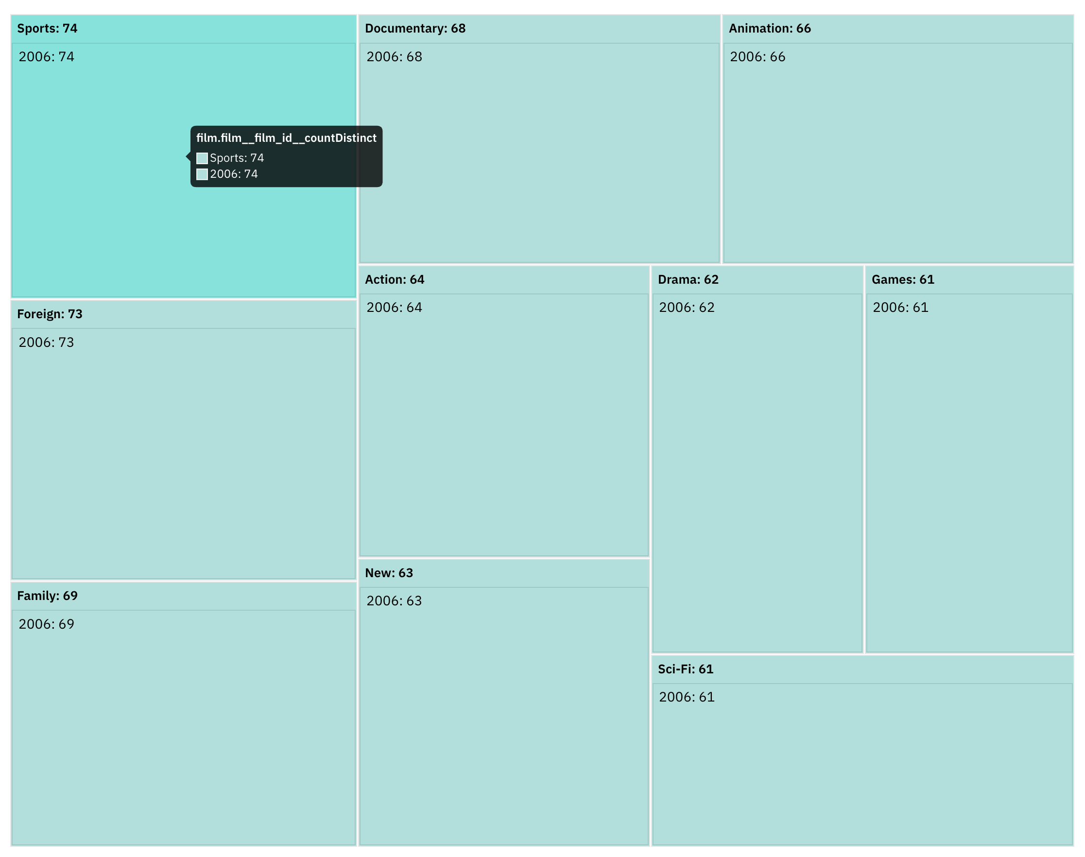
-
Treemap chart: shows how a total breaks down by category, like products by category or revenue by plan.
Step 4: Add your charts to a dashboard
Save the query, then add it to a dashboard: open the dashboard, click Add, pick the saved query, choose how it's displayed, and click Add Dashboard Item. Repeat for each chart until the dashboard has everything your team needs.
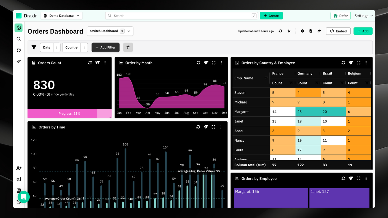
Draxlr dashboards also give you:
- Dashboard filters for text, number, date, and boolean fields, with values typed in or pulled from a saved query
- Drill-down on any chart, to see the rows behind a data point or break it down by another field
- Live data, so the dashboard reflects the latest Supabase data without a manual reload
- Flexible layouts, so you can arrange charts for the story you want to tell
Step 5: Set alerts, share, and embed
A dashboard is most useful when the right people see it at the right time.
- Alerts: get Slack or email alerts when your Supabase data changes, with checks as frequent as every 3 minutes.
- Exports and integrations: send query results to Google Sheets automatically, or access them through an API.
- Sharing: give chosen teammates access to a dashboard, share a public link protected by a PIN, or schedule email summaries for stakeholders.
- Embedding: on the Premium plan and above, embed dashboards in your own app with HTML, React, or Vue. On the Power plan, row-level security keeps each customer to their own rows. See how to create and embed a Supabase dashboard for the full walkthrough.
Key metrics to track in your Supabase dashboard
A well-designed Supabase dashboard helps you monitor the health and growth of your product at a glance. Focus on metrics that offer clarity, drive decisions, and surface trends early. Here are five to start with:
1. Total records or transactions
Tracks the volume of data or actions over time.
Example: Total orders placed this month, total appointments booked, or total invoices generated.
2. Growth rate by week, month, or quarter
Measures how fast you're growing across time periods.
Example: Monthly growth in active users.
3. Average value
Tracks trends using averages.
Example: Average revenue per customer, or average delivery time.
4. Conversion rate
Measures how many users move from one step to the next.
Example: Out of 500 visitors, 40 signed up for a demo.
5. Active and inactive counts
Shows how many entities are in use versus idle.
Example: 4,200 active users this week and 1,800 inactive users.
Conclusion
With Draxlr, you can turn raw Supabase data into a live dashboard in a few steps: connect your project, build queries with the query builder, raw SQL, or AI, pick the right charts, and set alerts so changes reach you. If you're still comparing options, see our roundup of the best Supabase reporting tools.
Connect your Supabase DatabaseFAQs
Does Supabase have analytics?
Supabase's Logs & Analytics feature monitors your project's services, like the database, storage, and edge functions. It doesn't build dashboards or charts from your own data, so for business analytics you connect an external tool like Draxlr to your Supabase database.
Can I build a Supabase dashboard without writing SQL?
Yes. Draxlr's no-code query builder lets you filter, join, sort, aggregate, and select Supabase data through a visual interface, and its AI turns plain-English questions into SQL. You can still write raw SQL whenever you want full control.
How do I connect Supabase to Draxlr?
In Supabase, click Connect on your project and copy the Session pooler host, port, database name, and user, plus your database password. In Draxlr, open Add Database, select Supabase, and enter those credentials. The session pooler works over IPv4, which external tools need.
Which charts can I use to visualize Supabase data?
Draxlr supports bar, line, area, pie, doughnut, and scatter charts, plus funnel, Sankey, treemap, map, and box-and-whisker charts. Each chart can be customized, and any chart can be added to a dashboard with filters and drill-down.
Can I embed a Supabase dashboard in my app?
Yes. On the Premium plan and above, you can embed Draxlr dashboards in your app with HTML, React, or Vue. On the Power plan, row-level security keeps each customer to their own rows in the embedded dashboard.
Does Draxlr store my Supabase data?
No. Draxlr syncs your schema, meaning table and field metadata, and queries your Supabase database in real time. Your data stays in Supabase.
About the author

Vivek is a coder and the founder of Draxlr who cares deeply about building good products. He works at the intersection of AI, SQL, dashboards, and embedded analytics, with a strong focus on making complex data workflows feel simple, useful, and fast for real teams.
If you have questions about anything in this guide, or want to compare options for your specific stack, you can email Vivek at vivek@draxlr.com, try Draxlr free, or reach out directly through the Draxlr team.