Dashboards play a crucial role in modern business environments for data visualization and analysis. They serve the essential purpose of providing a consolidated and real-time view of key performance indicators (KPIs) and relevant metrics within an organization, which enables decision-makers to quickly grasp trends, identify patterns, and make informed choices based on data-driven insights.
Continue reading as we reveal the 5 best dashboard building tools for SQL data in our most recent blog post.
The best dashboard-building tools for SQL data at a glance
| Tool | Best feature | Price(Starts at) |
|---|---|---|
| Draxlr | Generate SQL with AI. | $39/month(flat price) |
| Tableau | Drag-and-drop interface | $15/user/month |
| Looker | Unique modeling language: LookML | $5000/month |
| Power BI | Microsoft ecosystem | $10/user/month |
| Sisense | Single-stack architecture | Quotation Based |
Things to consider while choosing the best dashboard-building tool
1. The tool should be convenient to setup.
Having a tool that works great is awesome, but if it's a pain to set up, it becomes frustrating. It's crucial for a tool to be easy to start using, ensuring that people can quickly get it up and running without unnecessary complications.
2. The tool should have a variety of visualization options.
A great tool offers a bunch of ways to show your data, making it easy to understand and make wise decisions based on it. Diverse visualization options elevate a tool, transforming data into an engaging, comprehensible experience for users.
3. The tool should support embedding.
An effective tool goes beyond stand-alone dashboards; it should effortlessly integrate into various applications or websites. Whether spotlighting your analytics or illustrating order origins, embedding capabilities enhance the tool's adaptability. Users can seamlessly integrate its features into critical spaces, maximizing its functionality where it counts the most.
4. The tool should be easy to use to collaborate with team members.
Efficient collaboration is imperative, and a premium tool should seamlessly enable this. Consider a scenario where a tool, despite possessing exceptional features, complicates teamwork, defeating its purpose. Effective teamwork is foundational for success. Features facilitating straightforward collaboration transform the tool into a collaborative asset, ensuring members can collaborate effortlessly, thereby elevating overall productivity.
5. The tool should be capable of handling real-time or near-real-time data updates.
A proficient tool should ensure real-time or near-real-time data updates, avoiding the display of outdated information on the dashboard. Displaying outdated information on the dashboard diminishes its value. Users expect current stats when accessing the dashboard, emphasizing the importance of the tool's capability to deliver timely and relevant data for a more meaningful and informed user experience.
6. The tool should be able to set up alerts or notifications on data thresholds.
Enabling alerts or notifications on data thresholds is crucial for staying informed about significant changes, such as new installations or downgraded plans. The dashboard-building tool should offer this feature through communication tools or email, ensuring timely notifications when specific data thresholds are reached. This enhances user awareness and facilitates proactive responses to critical data changes.
7. The tool should be able to handle large databases.
The tool's scalability is compromised if it struggles with querying large datasets. Even smaller applications can accumulate substantial database data, necessitating robust handling capabilities from the tool. Therefore, it should effectively manage large databases to ensure their scalability and performance and meet diverse data requirements.
The 5 best dashboard building tools for SQL data
1. Draxlr
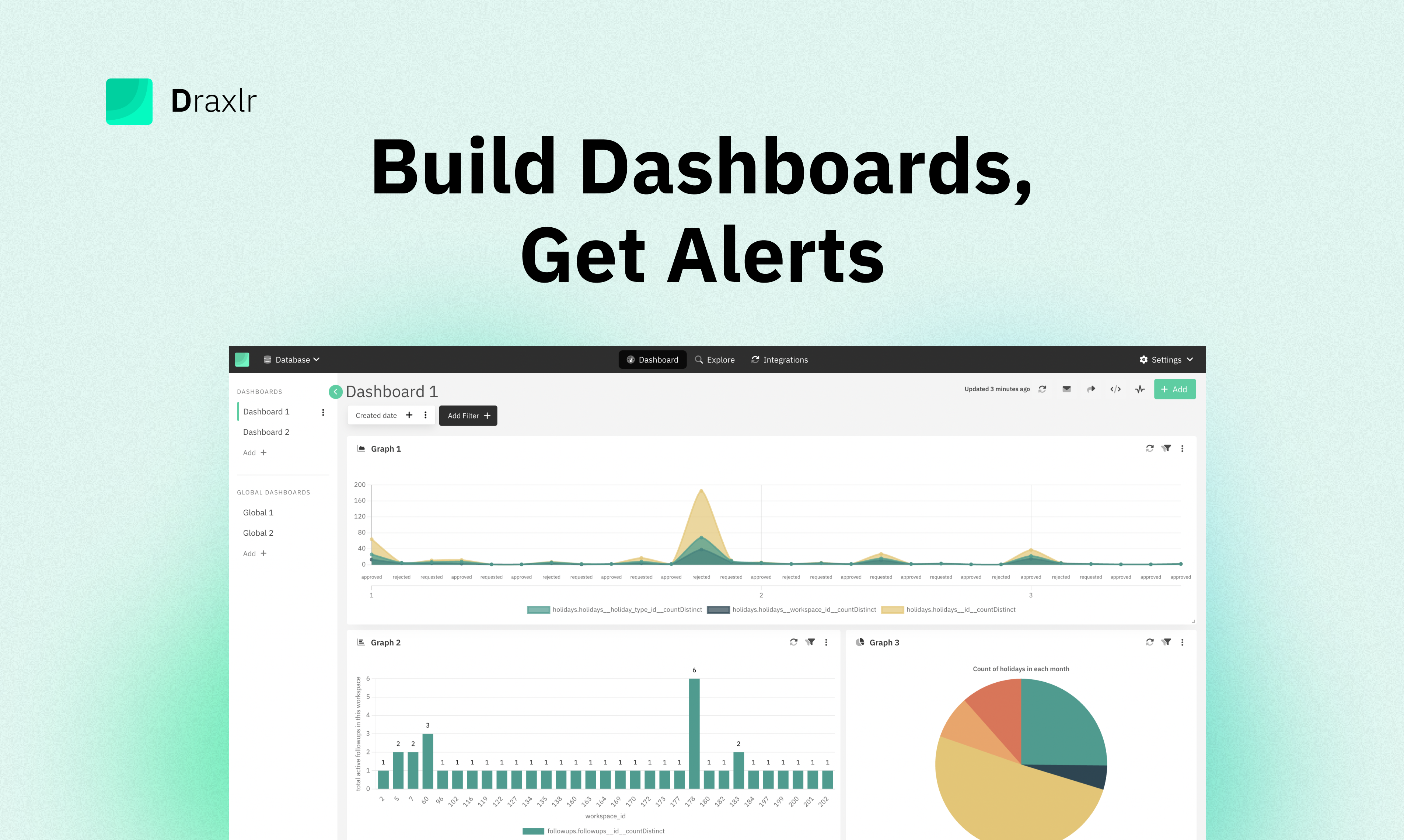
Draxlr is a modern self-serve business intelligence tool for growing businesses. Seamlessly connecting with multiple SQL databases, it transforms raw SQL data into polished dashboards effortlessly within minutes, eliminating the need for coding skills. Empowering users to effortlessly visualize and interpret data, Draxlr is tailored for modern business insights.
Who is it for?
Draxlr caters to small and medium-sized enterprises and entrepreneurs with freelance support. It addresses the specific needs of those seeking a comprehensive overview of critical data points, complemented by timely alerts. Draxlr empowers users to stay informed and make informed decisions, enhancing their business operations.
Best features
-
Generate SQL with AI:
With its cutting-edge AI feature, Draxlr continues to be at the forefront of innovation. By introducing artificial intelligence to the SQL generation process, users can effortlessly generate complex queries simply by communicating their requirements through written text.
-
Customizable Dashboards:
Users can explore a variety of graphs and charts within Draxlr, such as bar graphs, line charts, pie charts, maps, bubble graphs, and more, catering to different data visualization needs. The tool facilitates resizing dashboard elements for a personalized view. Users can effortlessly build queries and add query results with dashboard elements like "Sales Over Time," "Product Category Distribution," or "User Engagement Trends" into their dashboards for comprehensive decision-making. -
Dashboard Summary Email:
Users have the option to receive a condensed version of the dashboard directly in their email inbox. Customize the experience by setting the preferred email addresses, delivery frequency (daily or weekly), and specific delivery time. This feature ensures that the dashboard's key insights are conveniently delivered to users' inboxes at their specified intervals. -
Public Dashboard Sharing with PIN:
Draxlr facilitates effortless sharing of specific dashboards with team members or external collaborators. Generate public URLs for single or multiple dashboards, securing access through a regeneratable PIN for enhanced security. This feature ensures seamless collaboration and information sharing while maintaining control over dashboard access. -
Embed dashboard:
Draxlr lets you spice up any website with the embedded dashboard feature. And the best part: the flexibility to choose whether to include individual filters in the embedded dashboard adds a user-centric touch. Additionally, users have control over embedding permissions by specifying not-allowable domains, ensuring a secure integration tailored to their specific needs. -
Live mode:
Upon entering Draxlr's live mode, the displayed data reflects real-time changes. This feature proves valuable for dynamic showcases, such as presenting the live subscriber count of your app on a TV screen. -
No-code query builder:
Leveraging Draxlr's advanced filters, such as joins, summarize, and more, users can effortlessly generate queries without writing any SQL code. Additionally, a single click on the generate insight button automatically produces valuable query results from any table, streamlining the query generation process for enhanced user convenience.
-
Drill Down:
Users benefit from Draxlr's user-friendly one-click drill-down functionality. This intuitive feature allows for a smooth transition from broad insights to in-depth data, enhancing the overall experience of exploring and analyzing information.
-
Alerts - Slack, Email:
With Draxlr, users receive data change snapshots through both Slack and email. The tool allows for flexible alert settings, enabling users to schedule alerts at specific times (e.g., daily at 11 AM for yesterday's new installs count), set periodic updates (e.g., every 4 hours), or opt for alerts triggered solely by actual data changes. -
Google Sheets integration:
Users can seamlessly generate queries in Draxlr and effortlessly import the results into Google Sheets, streamlining the data-sharing process for enhanced collaboration and accessibility. -
Access saved query results via API
Users can retrieve saved query results through API responses, providing a resource for individuals looking to enhance and customize their dashboards independently. -
Export CSV:
Users can efficiently export various dashboard elements into a CSV format using Draxlr, providing a straightforward solution for data extraction and further analysis.
2. Tableau
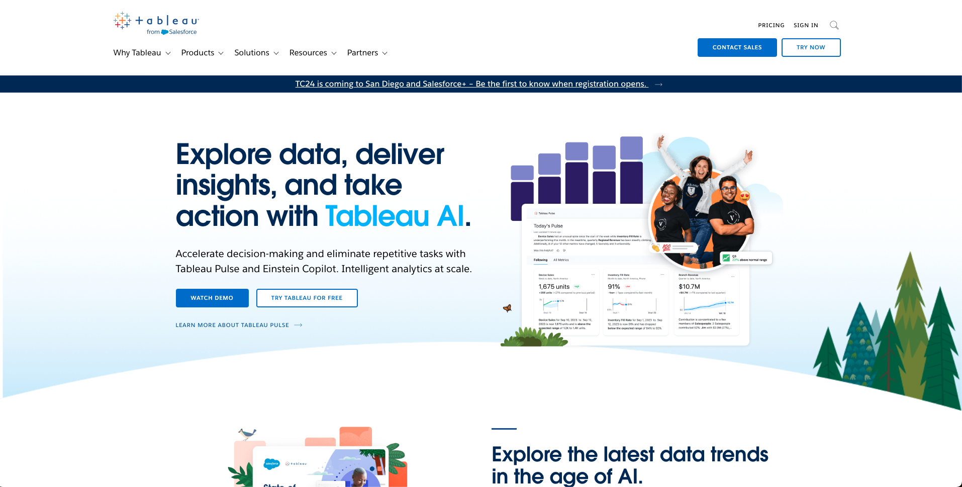
Tableau is a business intelligence software that was founded in 2003 to assist individuals in gaining a better understanding of their data. Tableau allows you to transform data into insights that can be put into action.
Who is it for?
Tableau is well-suited for midsize to large businesses with a larger financial capacity to meet their diverse data visualization requirements.
Best features
- Tableau lets you analyze and see data visually with a drag-and-drop interface.
- The Tableau Embedding Playground lets you embed Tableau visualizations.
- You can connect to a lot of different data sources with Tableau.
- Tableau has many types of charts, such as treemaps, bubble charts, and more.
- It offers a range of deployment options, such as on-premises, cloud, and hybrid solutions.
3. Looker
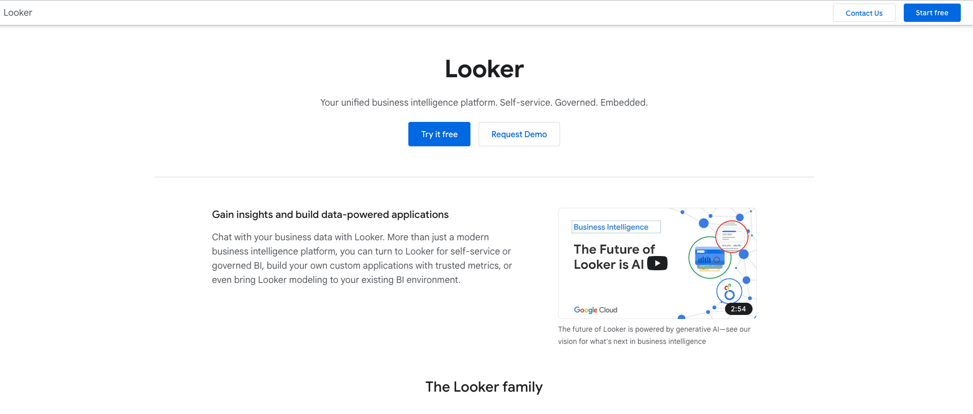
Looker is yet another business intelligence tool that Google's GCP purchased in 2019 to offer dashboarding and reporting solutions.
Who is it for?
Looker is primarily designed for large businesses that have substantial budgets. However, in order to use it, one must first become familiar with LookML, which necessitates support from the respective developers.
Best features
- Looker uses a powerful SQL-based modeling language called LookML to create semantic data models.
- Looker is directly connected to the database. It is BYODB.
- Looker is based in the cloud. There is no desktop version or such.
- Looker supports exportable reports and visualisations.
4. PowerBI
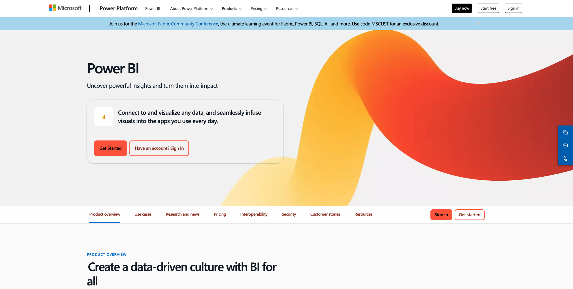
PowerBI is one of the leading business intelligence solutions that was officially released by Microsoft in 2015 to provide dashboarding and reporting solutions.
Who is it for?
Power BI is for a wide spectrum of users, but mostly for large businesses.
Best features
- Power BI allows users to embed Power BI reports and dashboards.
- Power BI includes a natural language query feature called Q&A, allowing users to ask questions about their data in plain language and receive interactive visual responses.
- The platform supports custom visualizations, allowing users to extend their reporting capabilities by incorporating visuals from the Power BI marketplace or creating their own.
- Power BI offers extensive data connectivity, allowing users to connect to a wide range of data sources, both on-premises and in the cloud.
5. Sisense
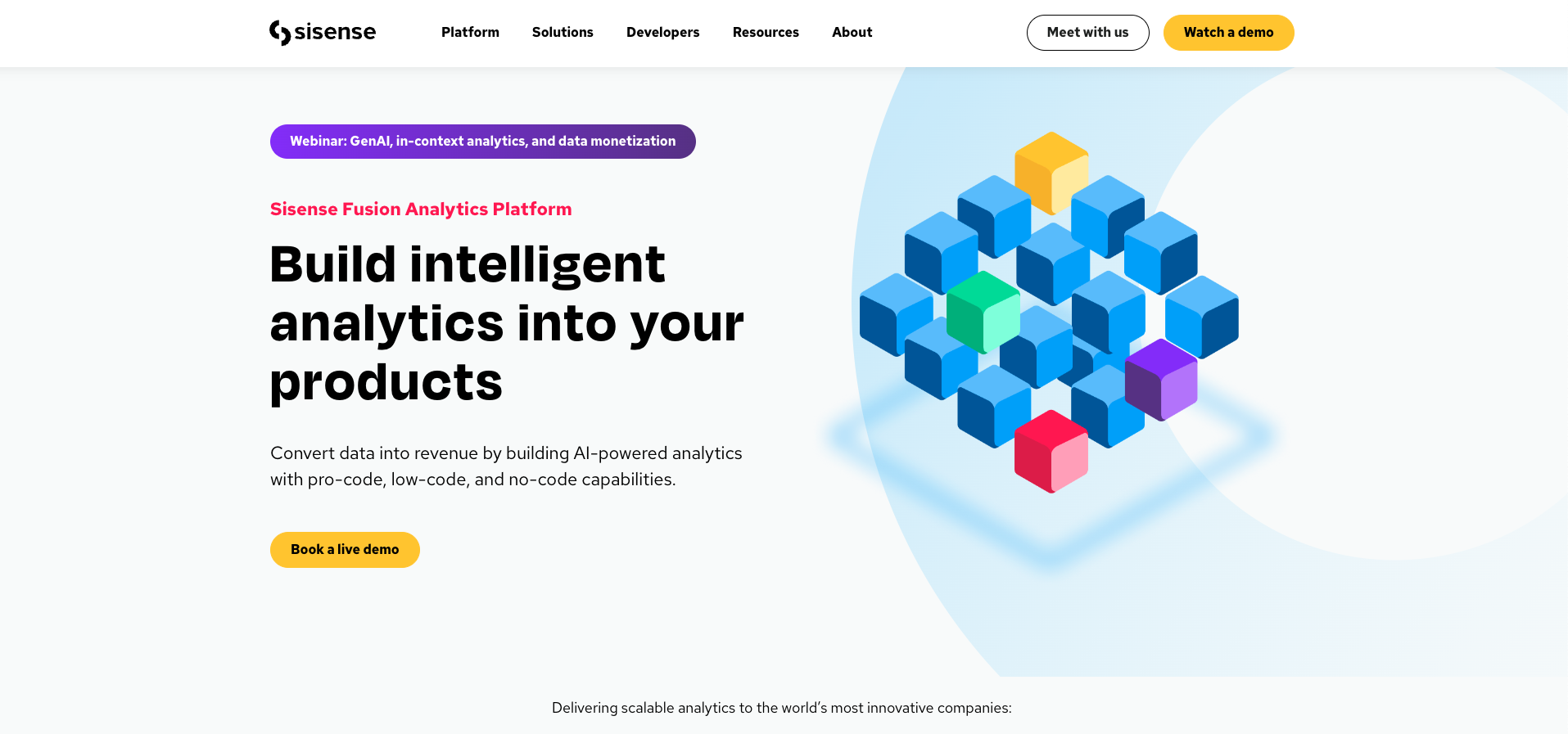
Sisense is the last business intelligence platform on our list, and it was founded in 2004. It operates on a single-stack architecture to provide insights as dashboards.
Who is it for?
Sisense is for midsize businesses and can also be considered for large ones. The pricing plan is a custom plan for each business.
Best features
- Offers both an on-premise and a cloud-based option.
- Sisense provides drag-and-drop dashboard creation functionality.
- Provides augmented analytics
- It connects with 100+ SQL and No-SQL databases.
Conclusion
We hope that this blog has assisted you in finding a dashboard-building tool that allows you to effectively visualize raw data and receive timely alerts for significant data changes. Empowering you to make informed decisions based on real-time insights.